Earlier this year I painted some tiny 3x3" lighthouses, and had so much fun that I went and bought a whole lot more tiny canvases. And did nothing with them. Clearly it was time to do more. I had taken a photo last August of a young raccoon that appealed to me, and I had a 4x4" canvas that fit the composition.
Step 1: sketch the raccoon onto the canvas

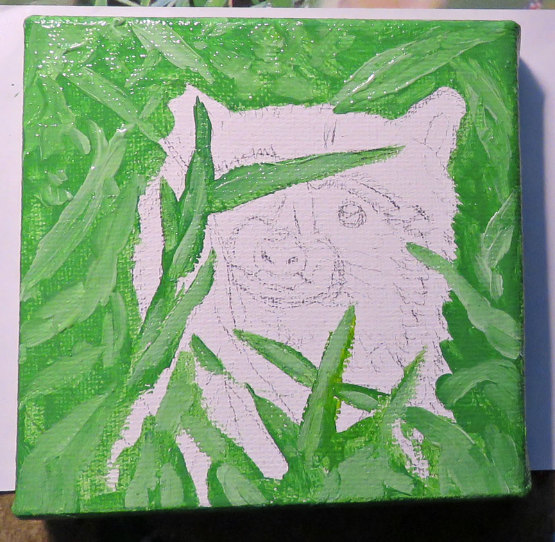
Step 2: paint some random light and medium greens over the background in leafy shapes
Step 3: Add bits of darker green for shadows

Step 4: Toss in a twig or two, and add the little flowers by quickly dabbing blobs of dark, medium, and light rose around

Step 5: lay down a light gray over the whole raccoon except for the white fur, and then place bits of medium gray to sort of map out the light and dark areas. It's at this point when I usually think about a painting, "Gosh, it looks like a big mess. Will it work out? I just don't know."

Step 6: Add the black in short, tapering strokes to simulate fur. Feel annoyed that all of your photos have too much glare.

Step 7: Use the Really Tiny Brush to add details, such as whiskers. Then try to find a place to take a photo without glare, and use a tea bag for size comparison.

Still too much glare!
Step 8: Find a different spot. At last, a glare-free photo! Whew.

That was enjoyable, though I really want to get back outdoors to sketch. Alas, it is getting colder every week. I shall probably have to find more indoor art to tackle instead until Spring.
Or . . . until the end of the year when you can change your New Year's Resolution again . . . yippee! Adorable raccoon. Great job!
ReplyDeleteI was just showing your cute little raccoon to my co-worker Suzy who was totally impressed and thought you should make designs for individual tiles and make a fortune. So many ideas, so little time!
ReplyDeleteGorgeous, I think I prefer the racoon in the one you think has too much glare. Cannot quite find the right description, better contrast or definition or something... Funny how we all see things differently, "In the eye of the beholder" I guess.
ReplyDeleteThe original does look more like the "too much glare" one overall in terms of color -- the bottom one without glare is a bit too far on the yellowish side. One of these days I'll figure out how to take photos of my art work!
DeleteThe original does look more like the "too much glare" one overall in terms of color -- the bottom one without glare is a bit too far on the yellowish side. One of these days I'll figure out how to take photos of my art work!
DeleteBut it is still gorgeous however the camera looks at it.
ReplyDelete